Little Foodies
Comprehensive mobile application designed for contemporary parents seeking to provide nutritional meals for their children.
UX / UI Case Study
Streamlined Onboarding Process
The streamlined onboarding process allows users to create profiles for themselves and their Little Foodies. Tailored questionnaires and personalization features enhance future interactions by suggesting relevant content.
.
Comprehensive Meal Tracking
Users can effortlessly document and monitor their child's daily meals using our comprehensive tool. By capturing every detail, including photos, reactions, and dates, they stay organized and gain valuable insights into their child's eating habits, ensuring balanced and nutritious meals.
Intuitive Health & Allergy Tracking
Users can easily manage their child's health with our intuitive health-tracking tool. By recording health information, including FDA-approved allergens, and tracking reactions, parents stay informed and proactive about their child's well-being, ensuring safety and health.
Case Foundation
Project Scope
September 2023 - March 2024
Design Role
Product Design, UX/UI, Research, Branding
Sector
Healthcare, Food, Nutrition & Wellness
Target Demographics
The app is intended for parents and caregivers, with an average age demographic of around 30 and older. The mindset of our target user is someone conscious about providing nutritious meals to their children, tracking their vitamin intake, and preventing picky eating.
Tools
Figma
FigJam
Marvel
Balsamiq
Miro
Optimal Workshop
Optimizely
Usability Hub
Research Methods
User Interview
Usability Testing
Card Sorting
A/B test
Problem
The prevalence of child undernutrition is a significant public health challenge. In 2022, an estimated 149 million children under the age of 5 years were suffering from stunting, while 37 million were overweight or obese.
Due to limited professional support and scattered educational resources across the web, many parents and caregivers struggle to address feeding issues and make well-informed decisions regarding their children’s nutrition. Parents often invest considerable time verifying each product's safety and nutritional value, resulting in unnecessary stress, potential allergen exposure, and choking hazards.
Problem Statement
Our users need a way to access reliable, centralized information on childhood nutrition and professional support to make well-informed decisions and address feeding issues efficiently, ensuring their children's safety and well-being without unnecessary stress and risk.
Objective & Goals
The primary objective of this project was to design a contemporary and engaging mobile app that streamlines access to personalized content and professional support regarding childhood nutrition.
The goals included:
Ensure user satisfaction by designing a seamless and intuitive onboarding process.
Match users with qualified professionals, who can provide personalized dietary advice based on their child's unique needs, ensuring reliable and contemporary nutritional information.
Increase user retention by providing tailored content around childhood nutrition.
Design Process
1. Emphasize
4. Prototype
Low-Fidelity Wireframes
Mid-Fidelity Wireframes
Competitor Analysis
User Research
2. Define
User Persona
Journey Map
5. Test
Usability Testing
Preference Test
3. Ideate
User Flow
Card Sorting
Site Map
6. Present
Design System
High-Fidelity Prototype
Peer Feedback
Accessibility
1. Emphasize
Competitor Analysis
I undertook a thorough Competitor Analysis, concentrating on 6 mobile applications dedicated to childhood nutrition and health data tracking. My goal was to glean valuable insights into prevailing industry trends and evaluate their features, flows, components, user reviews, interfaces, etc. To visualize the data I created a SWOT analysis and a comparison table to gauge competitor performance.
One noteworthy competitor, Solid Starts, displayed deficiencies in content accessibility, cultural representation, and accessibility of conventional product data. Armed with this knowledge, I am steering the design of the Little Foodies app to align with market demands and provide a seamlessly user-friendly experience.
Findings & Takeaways
2. Content for older children
There is a notable gap in the mobile app market concerning nutrition advice and recipe recommendations for infants, toddler-age children, and beyond.
1. Content personalization
The current landscape lacks sufficient attention to tailoring content for individual users.
5. Expert connection
There is an absence of opportunities to connect live with experts specializing in childhood development and nutrition beyond conventional pediatric services.
3. Real-time customer support
Lack of customer support available for users to message professionals in real time to work through their problems
4. Educational content
Educational resources are mostly absent, only some applications have content such as articles or courses, to keep users informed about childhood nutrition.
6. Multilingual support
The lack of language diversity for users to modify content hinders the ability of some products to penetrate international markets.
User Interviews
I began user research by conducting an in-depth user interview with four participants, each aligning with the target user profile:
Parents & caregivers of young children between the ages of 1 and 5 years old
These interviews provided insights into parents' challenges, successes in navigating childhood nutrition, pain points in accessing educational resources, and experiences with professionals in this domain.
Below are some of the quotes from the interview participants:
I don't cook often, usually opting for large batches of food for several days. I rely on organic frozen food for convenience.
-Brett
Father of a 4-year-old and a 2-year-old son
I'm struggling with my oldest child's picky eating habits, and it's affecting my confidence in providing nutritious meals. I'm at a loss for how to make positive changes.
-Emma
Mother of a 5-year-old and a 1-year-old daughter
While I appreciate my pediatrician's guidance, I've noticed that some of their methods, especially when it comes to solid food introduction, may be outdated and not supported by current research.
-Jamie
Mother of a 3-year-old-daughter
Empathy Maps
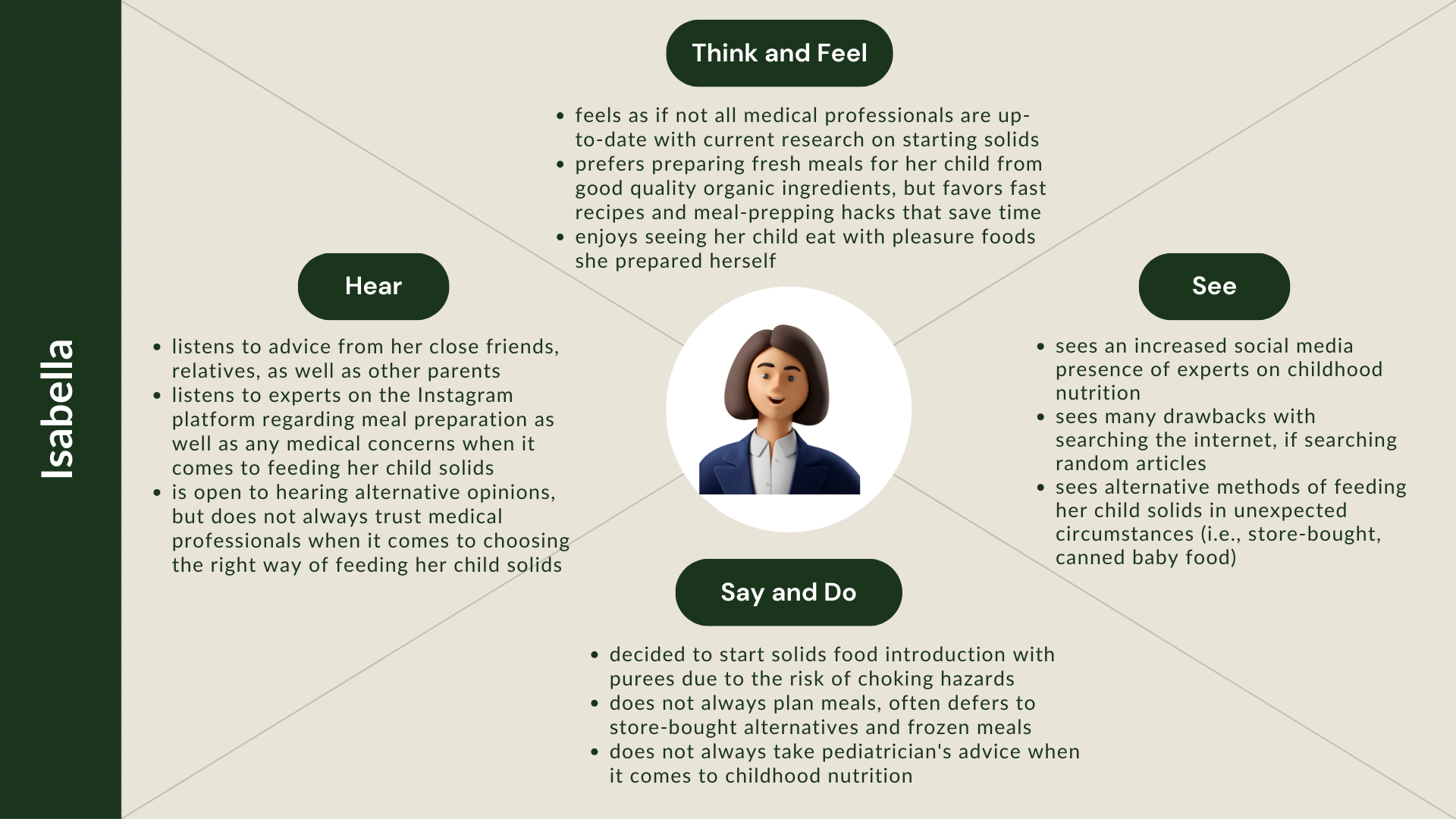
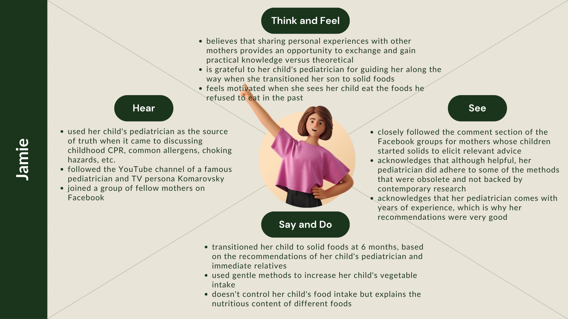
I leveraged the interview responses to develop empathy maps for each interviewee to visualize user attitudes and behaviors, allowing a better understanding of user needs, preferences, and pain points.
Affinity Maps
Affinity mapping was used to thematically analyze qualitative data collected during user interviews. By organizing the data in a structured manner, I gained a deeper understanding of user insights and pain points. This process enabled me to extract actionable to identify patterns, facilitating more informed decision-making in the design process.
User Research Takeaways & Design Decisions
1. Information Reliability
Research Result: concerns regarding the reliability of expert guidance, particularly from traditional healthcare providers such as pediatricians; outdated advice especially concerning the introduction of solid foods to infants.
Design Decision: customized search functionality for experts in childhood nutrition; advanced filtering options, sorting capabilities, and comprehensive provider descriptions
2. Fragmentation of Nutritional Advice
Research Result: frustration with the lack of a centralized, credible source for nutritional advice (books, social media, personal connections, etc.).
Design Decision: a multi-service app that consolidates insights on childhood nutrition, connects users with professionals, and tracks children's health data and meals. Integrated features for user reviews and comments to enhance information credibility.
3. Meal Planning Amidst Busy Schedules
Research Result: challenges in navigating busy work schedules while striving to create nutritious meal plans for children.
Design Decision: flexible and customizable scheduling options for consultations with experts
4. Insufficient Support Beyond Infancy
Research Result: a lack of professional support for children beyond infancy, particularly when dealing with challenges like picky eating, allergies, and neophobia.
Design Decision: personalized content based on a child's demographic information that drives targeted advice and support for feeding challenges beyond infancy.
2. Define
User Personas
I leveraged the insights gleaned from the user research to develop user personas that embody the traits and qualities of our target users, ensuring they accurately represent the needs, preferences, and pain points of real users.
User Journey
I employed user journeys to create a comprehensive view of the customer experience, illustrating how users navigate through the app to achieve various scenarios. These journeys not only outline the steps users take but also capture their thought processes, emotions, and actions along the way. Below is an example of a user journey designed for the following scenario:
As a new father to my 5-month-old baby, I would like to schedule a call with an expert on childhood nutrition and utilize the AI feature of the app to locate the most appropriate specialist.
-Jared
3. Ideate
User Flow
The next step was for me to create a detailed, user flow to outline the steps our User Persona Jared would take within the Little Foodies app to achieve the tasks outlined in the scenario above.
Card Sorting
Before embarking on the information architecture design, I conducted a closed card sorting exercise with 5 participants asking them to group 30 cards into 8 different categories. This allowed me to ensure that different components are interconnected and provide a seamless and user-friendly product experience.
Refined Site Map
The card sorting exercise allowed me to refine my site map components and ensure that users could easily find recipes, professionals to connect with, health tracking data, etc. I subsequently organized the data into the following site map to help guide my future designs.
4. Prototype
Low-Fidelity Wireframes
I developed low-fidelity prototypes with a focus on core functionality, quickly and with minimal detail. These prototypes served as early-stage explorations, enabling rapid ideation and iteration.
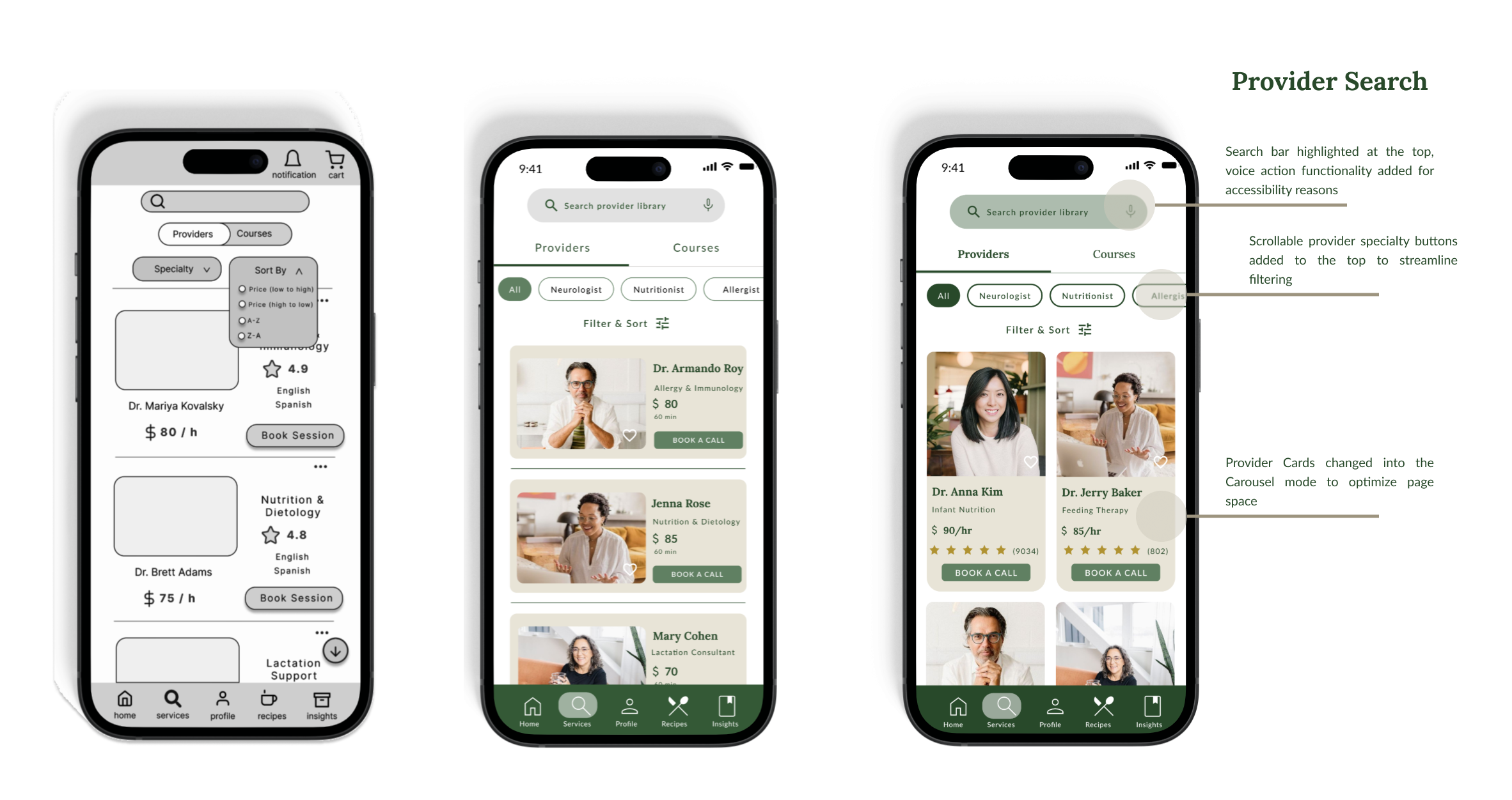
The mid-fidelity wireframes went through several design iterations. I eventually applied the Material Design principles, such as a carousel for provider search, to the wireframes to the desired level of detail.
Here are some of the screens I created ->
Mid-Fidelity Wireframes
Utilizing the low-fidelity wireframes and site map as a reference I created mid-fidelity wireframes. The main goal was to utilize these prototypes in a usability study to test the concept and user flows. Below are some examples of prototype iterations.
5. Test
Usability Test
Participants
I leveraged a qualitative usability testing method to be conducted on mid-fidelity prototypes, using a script to interview participants. The goal was to gain insights into user behavior and emotions while interacting with the prototype. The testing included three scenarios and was both remote and in-person.
Rainbow Spreadsheet
In designing the Rainbow Spreadsheet for simultaneous data documentation during the usability study, I structured it with clear categories: Positive Quotes, Negative Quotes, Observations & Solutions.
I integrated participant info, and set data entry guidelines, which enabled efficient recording of qualitative observations, quantitative metrics, and behavioral patterns presented by research participants.
Upgrades to the Design
Upon conducting usability tests I decided to redesign some of the existing screens such as Provider Search & Profile, to decrease the cognitive load of prospective users and streamline the user journey. Please see some examples below:
Preference Test
I applied the A/B preference test to obtain quantitative data on the two versions of the login/onboarding screens to define the main color palette and theme of the application. I ran two variations of an element (A and B) against one another and gauged their performance against a pre-determined metric.
Version A
Depicts images on a tinted background with orange fonts and accent colors.
Version B
Depicts images on a white background with dark green fonts and accent colors.
Test Results
75% of the participants show a stronger preference for Version 2 of the prototype design. They mentioned legibility, professionalism, cohesion, and relatability as key factors that impacted their decision. See what the participants had to say about the prototype below.
I like the design of this one better. It feels very cohesive.
Female (32.y.o)
Provides more context
Female (27.y.o)
I chose this because it is more detailed and easy to understand.
Female (64.y.o)
This one looks more like a pro service
Male (38.y.o)
It looks like I will get nutritional information which would help me and my little ones in the family.
Female (60.y.o)
6.Present
Design System
Colors
I decided to choose the color green as the brand color of the Little Foodies application. The color green is closely related to the natural world and the environment and encourages natural and wholesome food choices.
Logo
I opted for a minimalist, yet elegant and professional logo comprised of the product name, slogan, and an image of blueberry leaves and berries. Leaves and blueberries are often associated with health and nutrition and symbolize growth, which is a central aspect of childhood.
Primary
Primary logo is the most comprehensive variant and will primarily be used as a desktop website header
Secondary
Secondary logo is an alternate logo that focuses on the name and imagery, it will also be used on a desktop, tablet and mobile version of the product.
Typography
I selected the Serif font ‘Lora’ for the main components that stand out, such as headings and logo. The font would perfectly match the style of the product, providing an elegant and professional touch. I also incorporated the supplemental Sans Serif font “Lato” for paragraphs, descriptions, and main bodies for readability and legibility reasons.
Buttons
Clicked
Default
Hover
Components
Rating
Search
Navigation
Peer Review
I leveraged the Slack platform to conduct a peer review with three fellow UX designers to gain an understanding of some of the usability errors I could have made during the design process.
Dark Mode Option
I added the Dark Mode option because it can benefit users with light sensitivity or other specific visual impairments. It can also reduce eye strain, particularly in low-light conditions. For instance, parents use the app during nighttime or in dimly lit environments.
Before
After
Color Contrast
I leveraged the Stark Figma plugin to check the text color contrast of the prototype. I updated my primary color pallet and increased color contrast to make sure it adheres to the Web Content Accessibility Guidelines (WCAG), and to minimize eye strain, enhance legibility, and provide better readability for users with low vision.
Legibility
I updated the typography and text alignment in my prototype to increase its readability. I also updated the Navigation Bar text to make sure that the text size is set to at least 12px.
Accessibility
Increased Touch Target
I increased the touch target and created a larger version of the cards so that they could fit an updated button size. This adjustment should make it easier for all users with motor disabilities or dexterity challenges, to interact with the app. Larger touch targets reduce the risk of accidental taps and help parents who may use the app in situations with limited precision, such as holding a mobile device with one hand while multitasking.
Before
After
Prototype
Lastly, upon implementing the updates I created interactive high-fidelity prototypes that emphasized detailed functionality, incorporating realistic design elements and interactions. These prototypes represented advanced stages of the design process, offering a polished and comprehensive user experience. Below please see a video walkthrough of the prototype for the Home & Profile pages.
Future Takeaways
Throughout this project, I gained valuable insights into the intricate process of user-centered design.
1. Gaining a deep understanding of user needs and seamlessly incorporating them into the design. Crafting questions for user interviews was initially daunting, but tools like affinity mapping, and user journeys can help synthesize data and derive actionable insights, guiding future design decisions.
2. Iterative design is the most useful skill set for any designer, no design is final. Utilizing diverse user testing techniques during different stages of the design is imperative. For instance, a card sorting exercise, two rounds of usability studies, and peer feedback, significantly helped improve my prototype design,
3. Designing an app with multiple features is exciting yet presents a unique set of challenges. From selecting the right features to ensuring consistency in UX/UI elements, I learned to navigate the complexities of feature prioritization and coherence, ultimately minimizing user cognitive load.
4. Collecting user feedback during usability studies was another enlightening experience. Organizing the process efficiently and ensuring participants understood instructions were paramount to gathering actionable insights. This process highlighted the importance of clear communication and user-centricity in refining the design.
5. Working independently, albeit with feedback from peers, underscored the value of collaboration. While solo work allowed for autonomy, collaborative efforts proved more productive, emphasizing the importance of cross-functional teamwork in achieving project goals.
Finally, creating the final high-fidelity prototype highlighted the importance of great detail in the design process. Ensuring alignment with UI elements, functionality, and adherence to business requirements and user needs was essential for delivering a polished product that resonated with users.


